September 30, 2002
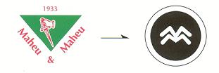
after 69 years, the dager in its green triangle was retired and replaced by a pictogram formed by two M's. Synonymous with safety, control, and peace of mind, the logo is a better reflection of our compagny's personality.
Dear customer:
You will soon notice certain changes relating to the presentation of our company. After having represented Maheu & Maheu for 69 years, the red dagger and green triangle will be withdrawn. For the past few years, the old image no longer reflected our development and inadequately illustrated our actual services. We have decided to modernize and enhance our corporate image to better demonstrate our commitment towards the Western Canadian market and National coverage.
Our new logo integrates our strengths and skills as a whole. It is in fact the reflection of our personality. The pictogram triggers curiosity. The green strip symbolizes security, flexibility, and confidence. The fact that both Maheu’s are linked to the “&” illustrates our solidity, reliability, teamwork as well as our reputable trademark. Lastly, the encircled pest clearly shows that we are in control of the situation.
The transitional process is already under way and the new image will be increasingly displayed through our communications over the next few months. We hope that you will appreciate the new image of our going concern company which evolves with the market trend and carefully listens to its customer needs.
Sincerely,
Michel Maheu, General Manager
go to top